I wrote before about why design system teams need content designers and what happens when they don’t include one.
Now I want to follow up on that with some recommendations about how to incorporate content guidelines into a design system’s documentation.
Content guidelines and their relationship to design systems
Content guidelines explain the rules, conventions and principles an organisation follows when designing content for its users.
They include things like voice and tone guidelines, spelling and grammatical rules, A-Z style guidance, preferred terminology, and content design principles and processes.
An organisation’s design system needs to promote, embody and propagate its content guidelines: Text elements like labels, error messages, hint text and headings should be designed with them in mind, and the decisions about how to achieve this must be documented.
Why it matters
Content design impacts a user’s experience as much—if not more—as visual, functional and technical design.
When someone creates content independently of visual design and code, or vice versa, they lack the context needed to create a coherent user experience.
Because of this, an important role of design systems is to encourage collaboration and knowledge sharing between content designers and other disciplines.
What’s more, many organisations don’t have enough content designers to work across all of their product areas. Until that changes, design systems must also equip designers and developers with the information they need to design user-centred content in the absence of a dedicated specialist.
Don’t just link out to content guidelines
It’s not enough for design system documentation to just link to some content guidelines that live somewhere else, and otherwise pretend they don’t exist.
This sometimes happens when an organisation has pre-existing content guidelines which are owned by someone other than the design system team.
Some organisations, like GDS, include both:
- an editorial division that produces longform content (like articles and advice guides)
- product teams that produce transactional or interactive content
These organisations may continue to need separate content guidelines which include rules that aren’t relevant to design system users.
Likewise, if the editorial teams are using a content management system (CMS) which restricts their control to text elements within preset templates, they’ll probably find much of the design system documentation unnecessary, even confusing.
But simply linking out to content guidelines from a design system (and possibly back the other way) is not an adequate solution.
We need to do the hard work to surface the content guidelines that are relevant to our design system users at relevant points in their journey, where they’re more likely to see and follow them.
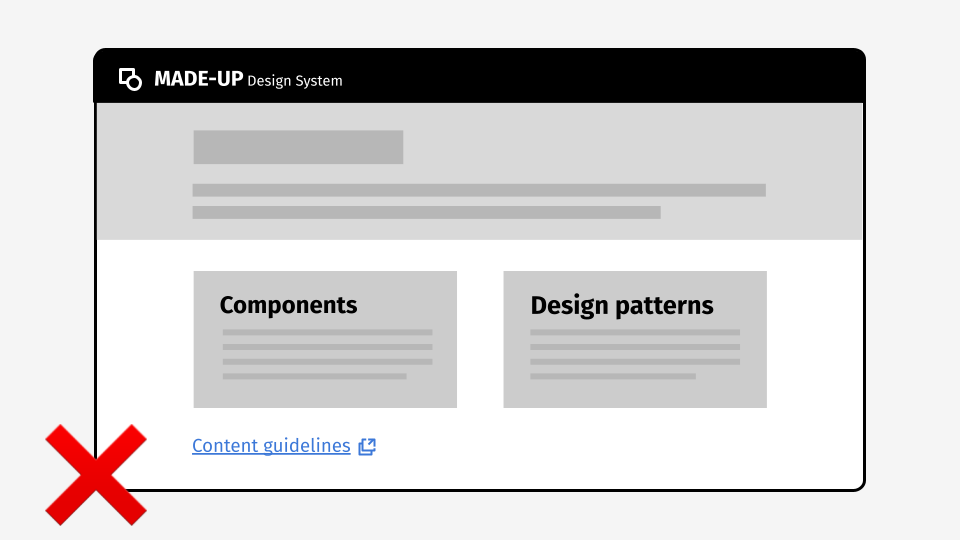
Don’t just create a separate section for your content design guidelines
For similar reasons, it’s also not enough to just bolt content guidelines onto a design system without properly integrating them into every part of the system they apply to.
A design system like this creates a clear division between “content” and everything else, and is likely to deepen entrenched disciplinary silos.
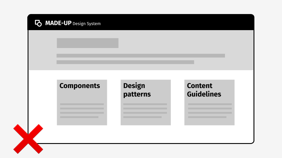
Don’t just link to content guidelines from component and pattern pages
Even linking to relevant content guidelines from individual documentation pages for components and patterns isn’t enough.
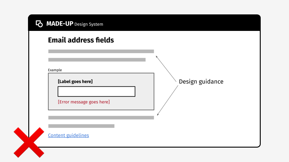
Using placeholder content, like "error message goes here" in component examples is a missed opportunity to demonstrate what good content design looks like. (For more on this particular subject, see my post on handling example copy in design systems.)
And although this approach shows the design system team has made more effort to highlight content design guidelines at the right points in the journey, it still requires someone to go somewhere else to look at them. Unless they consider it their job to do this, they’re probably not going to.
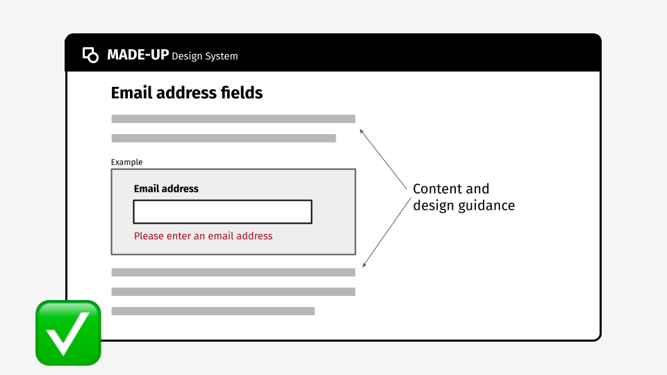
Combine content and design guidelines
For effective integration, design systems should use real content in examples, to show content best practice in the same way that they show visual design conventions.
Of the approaches I’ve shared, this is undoubtedly the hardest to implement—especially if you need to keep your existing content style guide or content design manual.
In this case, unless you’re going to employ structured content published into multiple places using a headless CMS, you’ll need to accept some repetition of content guidelines. This means having processes for keeping content design guidance in sync across more than one platform—but I’d argue that this is a small price to pay.
Proper integration of content and design guidance helps to reinforce that content design is as integral to a component or pattern as the way it looks and works.
It improves understanding across disciplines by helping non-content designers to see what good content looks like, and it reduces the chances of inconsistency and errors creeping into prototypes and products.