Design systems for humans
This post is based on my recent talk, Design Systems for Humans, from this year’s UX London. I’ll add a link to the recording once it’s available.
Something I’ve noticed in the past couple of years is a narrowing of our definition of design systems.
That definition tends to encompass the most visible parts of our design systems - the artefacts, tools and processes involved.
You’ll see that most conversations about design systems today centre around our component libraries, our documentation, how we integrate our systems with design tools, and our contribution mechanisms.
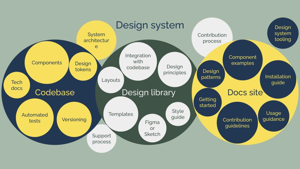
And whilst these things are usually critical to how we cultivate effective design systems (today at least), what concerns me is that we tend to focus on them at the expense of the human impact.
So let’s dig into that.
The human side of design systems
To talk about the human impact of design systems, we first have to think about the actual humans that this work touches.
I think it’s helpful to start by thinking about 4 groups:
- the people who create the design system
- the designers and developers who make our products
- contributors to the design system
- the people who use the products our organisations make
Let’s look at each of those groups in turn, thinking about how they operate within our design systems, and how it impacts them.
People who create the design system
Design systems are usually built and maintained by an individual or a team. They might be doing this as a full-time job, or as part of a different role.
I’ve sat in this group 4 times now. I’ve been lucky enough to work with some really brilliant people, but let me tell you: the work never stops being challenging.
And one reason for that, I think, is that we tend to significantly underestimate the work involved in creating and maintaining design systems.
Working on a design system: expectation vs reality
When we talk about the journey of establishing a design system, we often describe a linear, simple process.
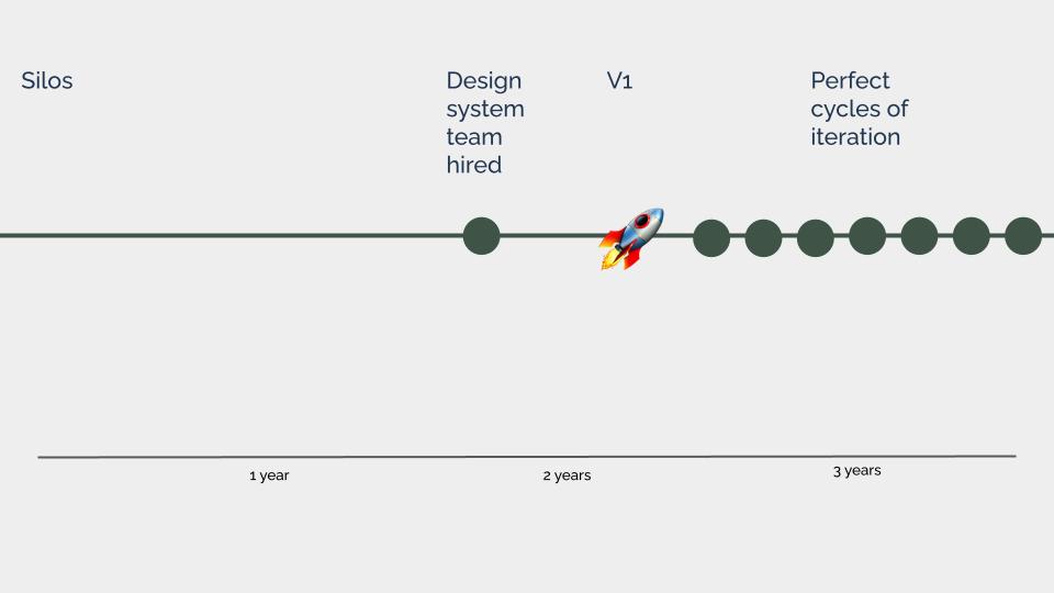
- Teams start off working in silos, until someone spots that a lot of repetition is happening
- A design system team is hired to create a single source of truth
- After a bit of time, version 1 is released
For some people, frustratingly, the journey ends here.
Even those of us who recognise that the work continues beyond v1 often envision that work happening as a set of predictable delivery cycles.
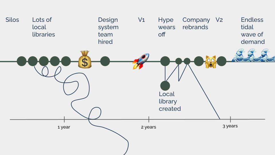
But this process doesn’t account for the many challenges, interruptions and curveballs we face along the way.
For example:
- the many team-level component libraries that pre-date our design system, and have to be reconciled first
- the teams who choose not to use our design system
- local libraries that consume our design system and have to be maintained
- company rebrands that derail our roadmap and necessitate us to pivot and release v2
- teams that can’t keep up with our release cycles, and end up falling behind
Then there’s the endless title wave of design system user demand that engulfs most design system teams post-launch: “Can we have a progress bar?”, “This card component doesn’t have the layout I need”, “This third-party agency is using different branding - how do we reskin this?!”.
Before I depress everyone too much, let me be clear: None of this is unusual, none of this is bad, and none of this is wrong.
The only thing that goes wrong here is that we often go into the process of establishing design systems expecting something different. We put all of our focus onto the moment we release version 1.
When we over focus on creating the artefacts and the most visible parts of our design systems, everything else feels like an interruption. These challenges are not going to go away - they’re just part of the work. But what if we started to think about design systems a bit differently?
If we could account for these obstacles within our design system definitions, we might just start to feel less like we’re fighting a battle, and more like we’re on a journey.
The designers and developers who make our products
As I touched on in the last section, not everyone will choose to use our design systems - and that’s who I’ll focus on here.
When teams don’t use a design system, it’s usually not about ego
In every organisation I’ve worked in and encountered - no matter how much work goes into creating the design system - some teams will decide to do their own thing.
When this happens, we tend to dismiss it as ego. We wave it away as vanity - ridiculing people for suggesting that our design system might stifle their creativity.
But I think that’s reductive. I think it’s become a handy caricature that we use to lump together all the people who treat design systems with suspicion - even if that suspicion is justified.
And I think the reality is more complex.
Why people don’t use design systems
A few weeks ago I was listening to a podcast on leading with purpose in the digital age. Brene Brown was interviewing Dr Linda Hill, a researcher, professor of business administration, and chair of the Leadership Initiative at Harvard Business School.
Dr Hill described working with organisations who invest in new organisational data systems only to find, 6 months or a year later, that no one’s actually using them.
She invites these organisations to think beyond the practical work of getting the tools in place, and consider what mindsets and behaviours their employees need to have to know how to work with them.
I think we often don’t ask ourselves what kind of mindsets and behaviours the designers and developers we’re building the systems for will need to have to know how to work with it.
People won’t use a design system if they think it:
- will create work for them
- doesn’t meet their needs
- isn’t meant for them
- threatens their job
These are not character flaws - they’re barriers we have to work through with them to make sure our design systems get used.
In short, we can’t just build design systems and expect people to use them: we have to change mindsets and behaviours on the way.
Contributors to a design system
Designers and developers working on product teams are the ones working most directly with our organisations’ customers,
So by allowing them to contribute, we can make sure that the design system is representative of the needs of the audience it serves.
Or at least, that’s the idea.
It’s definitely true that contribution has the potential to make design systems more representative.
But what happens if all the people who contribute look like this?

In most design systems I’ve worked on, there has seemed to be a lack of contribution from people of colour - particularly Black people, from white women, non-binary and trans people, from really anyone who didn’t look like this.
Contributors have tended to be white men, in technical roles - either developers, or designers who are comfortable coding.
More often than not, they are also the most senior and experienced members of their teams.
Our industry as a whole has a diversity problem - so it might just be that most of our potential contributors are senior white men in technical roles.
But the thing is that most of our products’ users are not. So if we want to create design systems that ultimately serve their needs - we need to do better.
A good place to start here is by thinking about what people need in order to contribute, and the barriers we’re creating for them.
Barriers to contributing to design systems
When I worked on the GOV.UK Design System, we’d noticed a concerning lack of diversity amongst our contributors.
We did some research to understand more about why this was happening and what we could do to address it.
We discovered that people need 4 main things to be able to contribute:
- time
- confidence
- motivation
- permission
And although it didn’t come up in that research specifically, I’d also add accessibility.
What this shows is that it’s far too easy to introduce barriers when we invite people to contribute to design systems - unless we’re really intentional about understanding what they need and what challenges they might face.
For example, if people need time to contribute, one thing that’s almost certainly going to make it hard is if it has to be done in their spare time because it’s not considered part of their role.
Aside from people who aren’t up for working in their spare time - which is, you know, fair enough - this will disproportionately impact people who have caring responsibilities outside of work, like parents and carers.
So we can address this barrier by working with managers and discipline leads in our organisation to make contribution a recognised part of people’s roles. This gives people a more of an equal chance to contribute.
This is just one barrier, but if we start to investigate and dismantle them across our system, we can make it easier for people from all backgrounds to contribute - and this work is ongoing.
Inclusivity means continuously investigating the barriers people face when it comes to contributing, and doing the hard work needed to remove them.
People who use our organisation’s products
Our design systems are made up of components, patterns and content.
And as product teams start using them to build websites and applications, these things start to get scaled across our digital landscape.
But design systems are not just harmless scaling machines. Multiplying things has no inherent value, unless they’re things we actually want to multiply.
To explore this, let’s look at an example.
Example: How we ask for people’s names
Most design systems include a pattern, maybe even a specific component, for a name field.
But when I think about how a lack of diversity in our industry as a whole shows up in our work, name fields are one of the first things I think about.
And that’s because lot’s of us working in this space hold narrow and biased beliefs about names.
Time and time again, we see examples of people unable to enter their name into online forms. There’s actually a whole Twitter account dedicated to validation error messages on name fields.
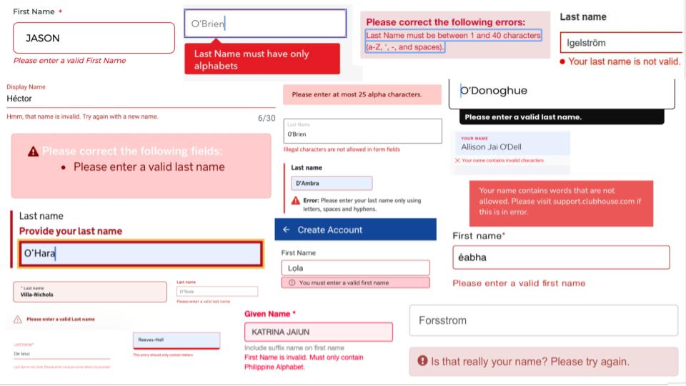
And when I was collecting these examples, I was struck by a recurring comment made by people on the receiving ends of these errors: “This is the story of my life”.
When this happens to people again and again and again, we’re giving them a clear message: this is not for you. We become authors in that story of exclusion.
Are we creating systems of harm?
In reality, our design systems cover much more than just name fields.
When we don’t design for this full human spectrum of identities and characteristics and circumstances and experiences that our design system needs to serve, we’re not just excluding people - we’re erasing them.
Because although our design systems might sometimes seem like harmless scaling machines, we’ve got to start thinking about the human impact.
What happens if our components are inaccessible? What if our patterns are discriminatory, or our content is exclusionary?
What happens is we create a system of harm.
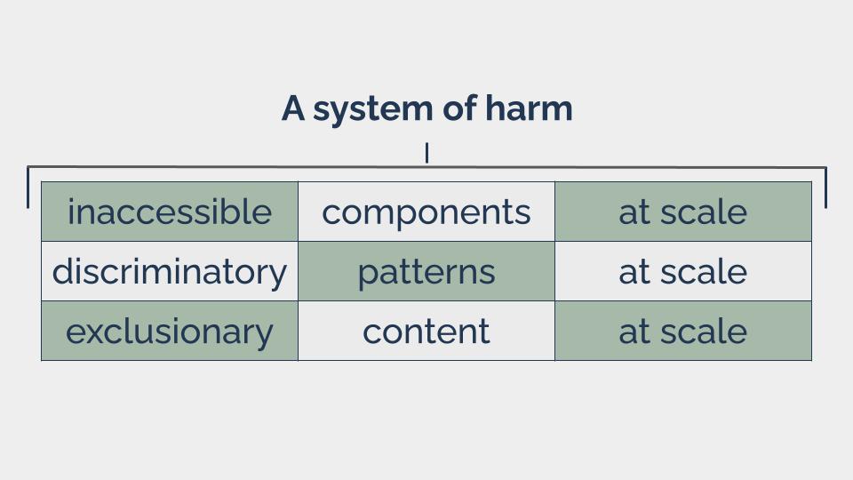
We industrialise discrimination, and set up a production line which lets us ship exclusion to the people using our products: quickly, consistently and at scale.
Reframing design systems
It’s my opinion that we need to reframe design systems, focusing less on artefacts and processes, and more on the people involved and the impact our systems have on them.
And I know that sometimes the suggestion of redefining design systems can make people wince. But I want to stress that I’m not talking about starting again - I’m talking about expanding.
I’m proposing that we broaden our definition, our perspective and our approach, to account for the human side of this work.
I really believe that if we move in this direction, we’ll end up with design systems that are better, and stronger, and kinder, because they’re more human.
