How to research components and design patterns
I co-authored this post with Caroline Jarrett and
Ignacia Orellana
In our last blog post collaboration, we talked about how to share research in design systems. We explained why it matters and what designers and developers need from it.
In this blog post, we’ll describe 2 challenges that we’ve encountered when doing research on the individual components and patterns in design systems, and 4 ways of overcoming them.

The challenges: Unless they work on a design system, most people don't focus on components and patterns
When we're working on our design systems, we’re trying our best to make the patterns and components we provide the best they can be. And we know that means researching them with people - people who use the products that they go into, and teams who create those products.
But while those of us working on design systems are fascinated by improving our components and patterns, the people we need to research with aren't nearly as interested in them.
Challenge 1: Users are more interested in overall services than components and patterns
In order to test patterns and components with people, we have to put them into a service of some sort to create a context.
But the people using that service will typically be much more interested in the service itself than the (more subtle) details of patterns and components.
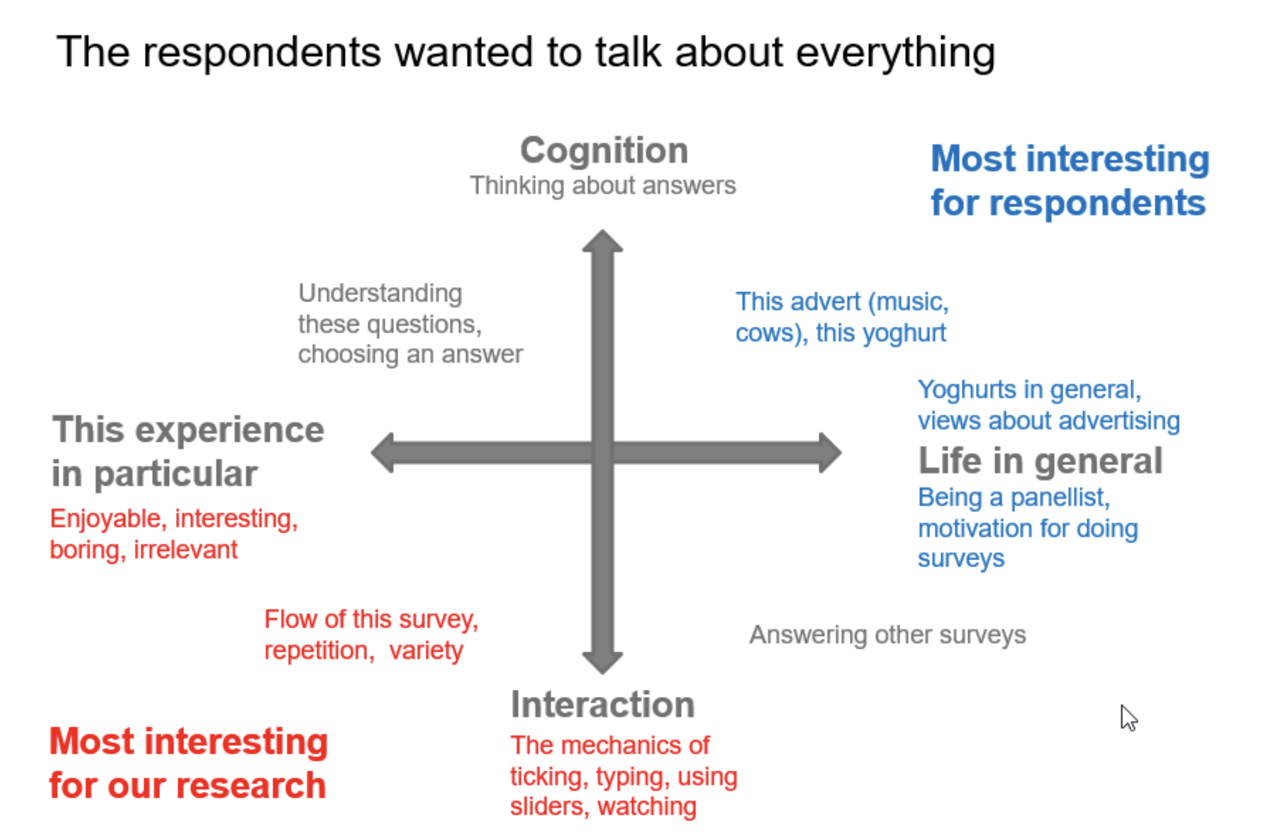
For example, Caroline worked with Kantar Operations to test some components in the context of a survey.
The research used an advertisement test survey, and asked respondents to share their reactions to an advert. The product team chose an advert for Muller Light yoghurt which featured cows running on a beach.
Respondents were happy to talk about cows and yoghurt in the research sessions, but they were somewhat bewildered by Caroline’s questions about the exact method of selecting an adjective from a list.

Challenge 2: Teams are interested in testing products and services, not components and patterns
Another approach to test components and patterns is to find a team already using them in a service or product, and get them to do the research instead. After all, the teams creating products and services that happen to use your design system will be testing them with users all the time.
Quite rightly, though, teams will be focused on the research questions and hypotheses that are most relevant for their work - not yours.
This makes it easy to assume that components and patterns are working well - when in fact, problems might simply be going unnoticed.
For example, many service teams across the UK government researched dozens of services that used an older style of GOV.UK radios.

The Government Digital Service (GDS) team that looked after the components were not flooded with complaints from users, and nor did any designers or developers notice any issues.
But when the design system team observed research that colleagues were doing on their services, they discovered some problems.
They noticed that people with tremor or other conditions that cause poor motor control were struggling to point to the tiny targets.
They also noticed many people without a motor impairment were wasting time positioning their pointing device exactly on the target - not realising that the grey area was also clickable.
GDS has since updated the radios and checkboxes on GOV.UK.
Four ways to research components and patterns
Despite the challenges, we have found ways of researching patterns and components. So here are four ideas that we have found worked for us.
1. Make it clear when components and patterns need more research, so that developers and designers know what to look out for
Many design system teams would prefer to have every single component and pattern researched to a high standard before including it in the design system. But in our experience, that’s not realistic.
Sometimes decisions about what to include are based on instinct or design flair. Sometimes the need to ‘just get something out there’ is compelling. And sometimes we have a solution that works for one team but don’t yet know if it will work for others.
We’ve learned that being honest about this is a good way of getting teams who use our patterns and components to help with research.
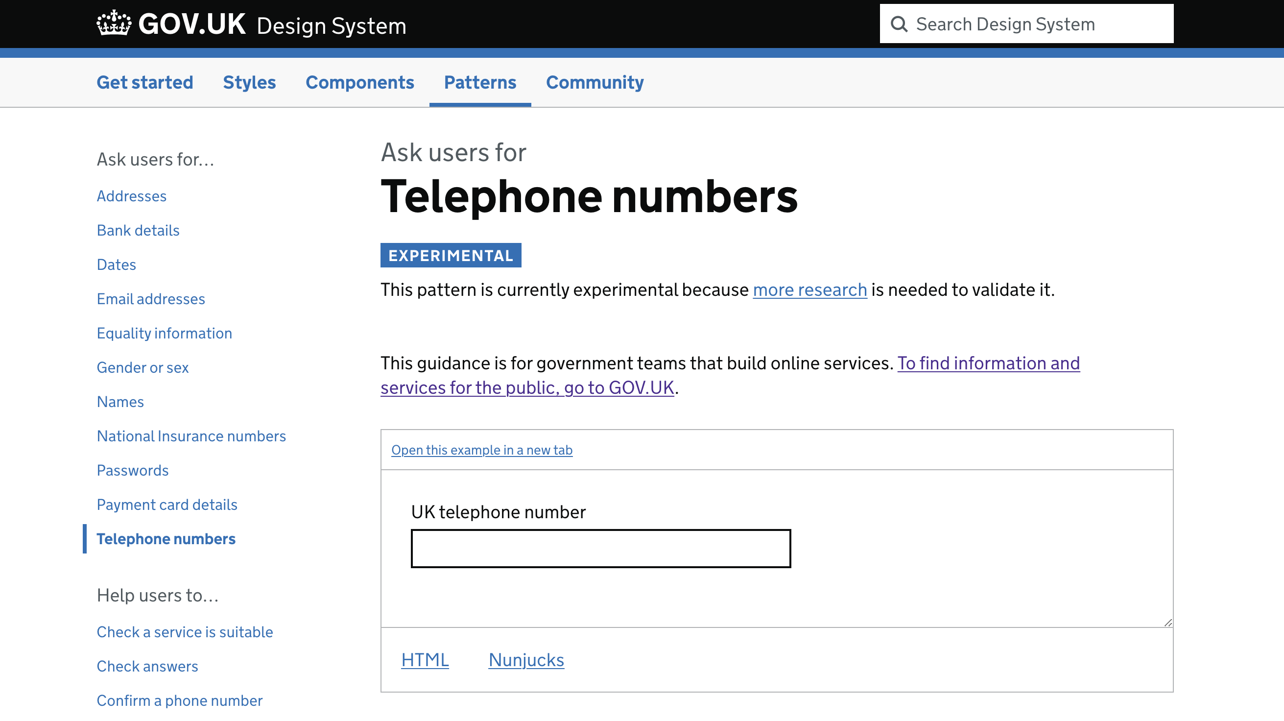
The GOV.UK Design System approaches this by labelling components and patterns that need more research as “experimental”.
For example, this pattern for Asking users for Telephone numbers explains that “more research is needed to validate it”, and the pattern’s research section describes what research is needed.


Some teams will avoid using anything experimental, but others are glad to have something to start from and are willing to take on the task of doing some extra research in exchange.
2. Make it easy for designers and developers to share research findings - but don’t rely on it
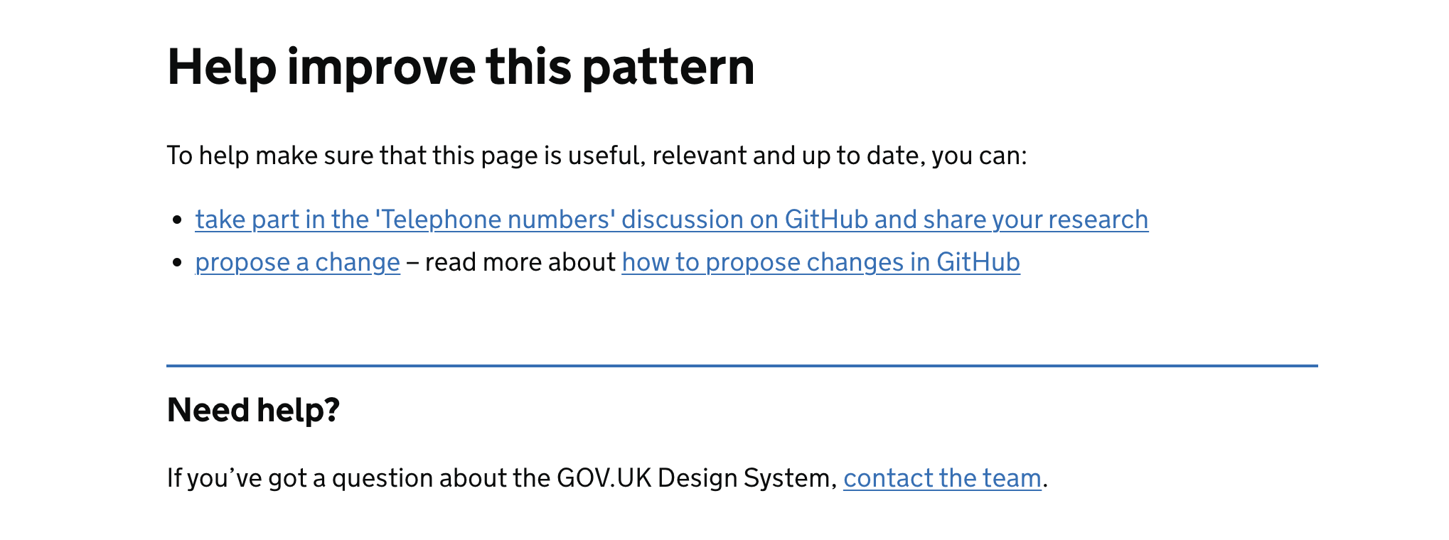
Design system teams that have opened their design systems for contributions and feedback might be able to encourage teams to share what they’ve learned through testing.
We’ve seen through user research conducted with designers and developers that the main barriers to contributing are a lack of:
- time
- confidence
- motivation
- permission
If you want people to actively share insights, work to remove as many barriers as possible from your contribution process. Make it as quick, straightforward, rewarding and accessible as you can.
When a designer or developer does notice a repetitive problem, and takes it upon themselves to tell you about it, celebrate!
Try to make dealing with that issue a priority. If you can’t, then give them a clear indication of how valuable the insight is, and how soon you will be able to get to it. Whatever you do, don’t let that insight just disappear without any follow-up - that’s disappointing for the person who made an effort for you, and will discourage them from contributing again.
Ultimately, the responsibility for stress-testing components and patterns falls on the team that builds and maintains the design system - not the teams who use the design system. So although we definitely recommend that you encourage teams to contribute, don’t rely on contributions as your only source of research.
3. Attend teams’ user research sessions so that you can see how people use the components and patterns yourself
In our previous post, we mentioned the value of observing research that’s happening anyway, so that you can see for yourself how a component or pattern is working.
Teams are often glad to have an extra observer, especially if you volunteer to take notes for them. Many teams also appreciate an opportunity to spend a bit of time sharing experiences and questions about the design system.
Being at the testing session means that you can focus on how the component or pattern is working, while the team focuses on the service or product as a whole.
The only disadvantage of this approach is timing. The team creating the service or product will do research when it suits their deadlines and timetable, and that may not line up with your work on your design system. But this information is valuable - so it’s worth being as flexible as you can with your timings.
4. Create a fictional service for research purposes, to test your components and patterns
If there’s no real service or product where the deadlines line up with yours, then you can try building a service solely for research purposes. The benefit of this fictional service or product is that it’s under your control. The downside is working out how to make it feel realistic enough to your users, without having too many distractions - like the cows and the yoghurt that we mentioned in our first challenge.
GDS colleagues built a prototype service called “Apply for a Temporary Event Notice” to research some new components and patterns. It was based on a real government service - but one that wasn’t actually available online at the time.
This meant it would appear realistic to research participants, but had been carefully designed around the design system team’s research questions.
For example, the prototype included a character count component, and one of the research goals was to learn how users responded when they exceeded the character limit.
To test this, the team set an intentionally low character limit for one of the answer fields. This meant that most participants exceeded the limit, and the team could observe their response.
Read more on how GDS researched its character count component.
Do the research - and try more than one approach
Doing research on individual components and patterns is certainly challenging - but it’s a problem worth solving: Design systems that are grounded in research help teams to trust and use them, and lead to better user experiences.
Each approach to researching components and patterns has its pros and cons, so it’s best not to rely on just one.
Enlist the support of teams using the design system by making it as easy as possible to report relevant research findings. This includes being clear about research gaps, so teams understand what to look out for.
To get the best from observing research being done by a product or service team, be respectful of their timings and adapt to their needs.
Finally, don’t rely solely on second-hand research from teams using components and patterns in their services. Be proactive and creative, designing research that removes unnecessary distraction and helps answer the right questions.
