Structuring documentation in multi-brand design systems
I’m now working on my second multi-brand design system and am again facing the challenge of how to structure, write and present documentation for 3 different brands.
Let’s assume that at least some of what we provide is going to be brand-specific. This is usually the case if our brands are intentionally different, and we’re not trying to consolidate them into one.
2 questions we always face with multi-brand design systems are:
- what's universal and what's brand-specific?
- how do we present that information to the system’s users?
Here I’ll explore those questions, and how I’ve approached them with clients.
For simplicity, I'll focus this post on structuring that information in a documentation website.
I won't cover the documentation that lives in design and dev tools, like Figma, Storybook or GitHub - although I'll mention it at the end.
What's universal and what's brand specific?
This varies depending on the organisation and its design system’s goals, so it’s important to understand the context when exploring this question.
For example, a client I’m working with now includes several brands that were brought together in a merger and haven't previously been thought about as parts of a single entity. That means there are lots of differences that we have to deal with, but probably wouldn’t have introduced intentionally.
Stuff that's universal
In my experience, things that apply to all brands have included:
- UX writing principles, for example, how to write error messages
- relevant content styles, including grammatical conventions
- accessibility standards and guidelines
- guidelines on component structure and layout, for example, the order of form labels, hints, error messages and inputs
- guidelines on component behaviour, for example, “don’t use inline validation on form inputs”
- the steps (and their order) of common user flows, like registering, or signing in and out
- content about the design system, for example, guidelines on getting started, contributing and getting support
Stuff that's brand-specific
Things that have varied from brand to brand have included:
- voice and tone guidelines
- context-specific content patterns, like the label used on a purchase button
- how colours are used
- certain design foundations, like typography, colours and use of imagery - I don’t see organisations differentiate spacing and layout as often
- the way components are visually styled - like the fonts or colours used on a button or an error message
Taking the time to understand the overlaps and differences across our organisation's brands is an important step in deciding how to structure our documentation how to present it to users.
It’s also worth thinking ahead: does the situation we’re working towards differ from where we are today? If it does, how might we design our system’s documentation to support this future state, and to make sure it doesn’t constrain us?
How do we present this information to users?
When thinking about how we should structure and present universal versus brand-specific information to our users, my start point is always to ask: What do they actually need to know?
There’s certainly something to be said for keeping our documentation architecture consistent with the architecture of our frontend and design libraries. If components are organised into universal and brand-specific categories, it might be helpful to reflect that in the way we organise our documentation.
Then again, is this actually helpful for our users?
For example, if we know that most people who will be using the design system only work on one brand at a time, do they need to know whether a component is universal or specific to their brand? Do they need to know what components are available in other brands?
These are not rhetorical questions and we should explore them openly.
It’s useful to ask what information serves our system’s users, working to reduce noise wherever we can.
4 options for organising guidance in a multi-brand design system
1. A separate destination for each brand
At the extreme end, we could create a separate documentation site for each individual brand.
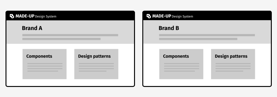
This approach might be useful if:
- we know our users only ever work on one brand
- our brands are very disparate and the documentation we need to provide for each one differs considerably
But - and this is a big but - publishing design system documentation to multiple places means maintaining that documentation across multiple places.
If we create completely separate destinations for each brand, we’ll probably need to provide some of the same information in each of them. In my experience, even when brands are stylistically very distinct, there are a lot of baseline principles and rules that don’t need to change.
And unless we’re using structured content to manage design system guidance from a single source - which is not something I see many teams doing today - the maintenance burden can quickly escalate beyond our capacity to keep up.
That’s why I favour publishing as much guidance as possible to a common destination, and only splitting information by brand where we really need to.
2. Let users choose a brand on the homepage
Another option we have is to organise our guidance by brand on our documentation site’s homepage.
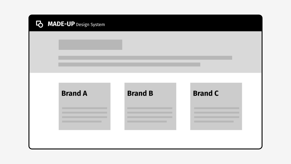
This means most of our design system documentation will still live in brand-specific sections. But it does let us provide universal guidance about our system, like:
- an introduction
- installation guidance
- information about the design system team
- contact details
- contribution guidelines
This is the approach we’re taking today on my current client’s design system, and my early observation is that we’re having to repeat a lot of information for each of our 3 brands - particularly in our accessibility and content guidelines.
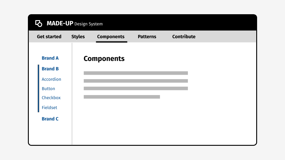
3. Split some sections into brand-specific sub-sections
If certain parts of our system differ more than others across brands, we might choose to split some sections by brand but not others.
For example, we might conclude that our styles and components are different enough to warrant brand-specific sub-sections, but that our patterns can be shared.
4. Use in-page navigation to split some guidance into brand-specific sections
Finally, we could consider using some form of in-page navigation - like tabs - to provide some brand-specific and some universal documentation.
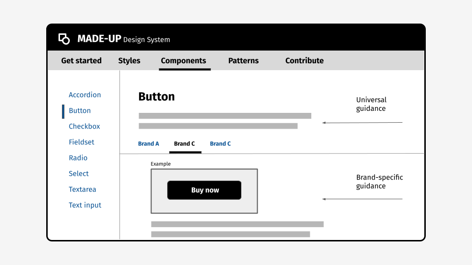
This means users see only the documentation that’s relevant for them. To bolster this, we could even ensure the default open tab is based on a user’s last interaction: If they selected Brand B on their last visit, we’ll make sure Brand B is the selected tab the next time.
From our point of view, it means we can decide whether or not to provide brand-specific documentation on an item-by-item basis.
This flexibility is particularly helpful if our design is changing - either towards or away from a consolidation of brands.
At the time I was working there, this is the approach we opted for on the BT design system.
Some downsides are:
- tabs can be problematic from a usability and performance perspective
- this doesn’t provide a neat solution in the case that 1 brand is an outlier, but 2 or more brands share guidance - although arguably that problem isn’t unique to this solution and isn’t made worse by using tabs
Beyond multi-brand: the many dimensions of design systems
I don’t pretend to have a perfect solution to this problem, but I hope this post has given you some food for thought.
It’s worth considering that I’ve only talked about multi-brand design systems here, but we also increasingly need to cater to:
- multiple platforms, like web, native apps, voice and more
- multiple localities with different languages
- different tech stacks
- various tools that interface with our system, like Figma, Storybook, GitHub and documentation sites
With that in mind, I believe the case is becoming clear for developing a content model to manage design system documentation and guidance.
If you’re exploring this already, I’d love to chat to you. You can get in touch on Twitter or email me on amy.l.hupe@gmail.com
