Why you don't need a separate design system for internal services
Over the years, internal tools and services have suffered from a real lack of user-centred design.
Whether it’s requesting holiday through an HR portal, updating a website using a CMS, or managing user accounts through an administrative system, these activities are often needlessly painful, forcing us to wrestle with UI that we’d never dream of giving to our external users.
The good news is that many organisations are now investing time and money in properly designing these tools. But when it comes to supporting these efforts with design systems, there’s still a way to go.
Many teams designing and building internal services will discover gaps in their organisation's design system, finding patterns created for consumer-facing products that aren’t fit for their purposes.
And this often leads them to a common question:
“Should we create a separate design system for our internal services?”
In this article, I’ll explain why I think that’s the wrong solution, and what to do instead.
Colleagues are users too
There’s a poster you’ll see on the walls of various government buildings. It says “Civil servants are users too”. It’s a reminder to hold internal services to the same standard as you would a public-facing service.
And this principle is just as applicable outside of government. If we want to create inclusive workplaces, we need to provide usable, equitable experiences to our colleagues as well as our users.
Building a separate design system makes the problem worse
The reason that so many internal tools are poorly-designed, is that they’ve consistently been treated as secondary—or at the very least, separate—to the products we build for our customers.
Creating separate design systems to support internal services deepens this disconnect, creating a breeding ground for unhelpful and false ideas like:
- internal services don’t need to be accessible
- we don’t need user research on internal tools
- our users are experts so we don’t need to use plain language
To truly improve the state of our internal services, we have to centralise the process of designing them. And that means doing the hard work to serve them with our existing design systems.
Creating separate patterns won’t help either
Just as I wouldn’t advocate creating a separate design system for internal services, I’d urge against creating specific internal service patterns.
Admittedly, doing so might be the simpler option in the short term. There’d be no tedious updating of patterns to make them work for internal services, or work to incorporate existing design patterns into established staff tools.
But long-term, it’s a sustainability nightmare. Maintaining at least 2 versions of each pattern —one for consumers, one for colleagues—is inefficient, and creates needless complexity for the many teams who work on both the consumer and colleague-facing sides of their service.
Designing patterns for internal services
Look for the overlaps before the discrepancies
None of this is to say that internal services will never need a different treatment to those designed for consumers, but that’s a lot different from saying they always do.
For starters, as well as context-attentive design patterns, most good design systems include a strong set of context-agnostic foundations, like typography, colours, spacing, common form inputs, buttons, tabs, accordions, tables and so on.
These foundational elements really don’t care where they’re used, so extending them to our staff tools should be straightforward, and reduces our maintenance costs. The hard work has been done, so why do it again?
Even when it comes to more context-specific aspects of our system, the beliefs that underpin differences in our colleague and consumer-facing services are often false.
For example, a common objection to using certain content conventions in internal services is that it dumbs down and frustrates experts. But there’s plenty of evidence to show that even experts prefer plain language.
And an even more unpleasant belief held by some is that tools for our colleagues don’t need to be accessible, leading to UI that’s riddled with “space-saving” form controls, images and icons missing alt-text, and poor contrast ratios.
But given that there are 13.9 million disabled people in the UK alone, it’s nonsensical to assume none of them do, or could, work in your organisation.
What’s more, there’s a wealth of research that shows designing accessible services makes them universally more intuitive to use.
By challenging our beliefs about what differentiates colleague and consumer-facing services and looking for areas of overlap, we can more easily create solutions that work for both.
Consider user needs over user types
Classifying users as either internal or external users is problematic. Among other things, the lines are often blurred.
The GOV.UK Design System and the GOV.UK Service Manual—both of which I’ve worked on—are primarily aimed at civil servants and those working on government services. Yet both are publicly available, and often referenced by people outside of the organisation.
Rather than focusing on user types, I think it’s more useful, and more interesting to consider what characterises a service and how people will use it.
For example, internal services like caseworking systems often need to optimise for regular use over simplicity of first-time use. A little extra time spent getting to grips with more information-heavy screens on first use might be an acceptable trade off for a more efficient experience on return visits.
And although we probably wouldn’t make this same trade-off in a consumer-facing contact form—which is unlikely to be used frequently—we might do so in something like a messaging platform which is designed to be used often.
By designing things based on user needs and not service types, you’re less likely to find yourself restricted to supporting only external or internal services.
Design flexible patterns
To effectively accommodate internal services in a design system, components and patterns need to be flexible enough to handle varying contexts.
This can be achieved through a combination of versatile components and contextual usage guidelines.
For instance, there’s no reason we can’t use the same buttons in a consumer sign-up flow and a customer account management tool.
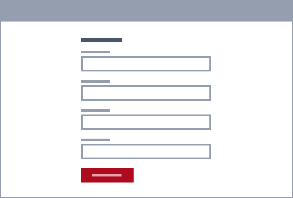
For the sign-up flow, we can assume most users are only going to do this once. As such, we might try to reduce their cognitive load by sticking to one main call to action per page, and recommending only one button is used.

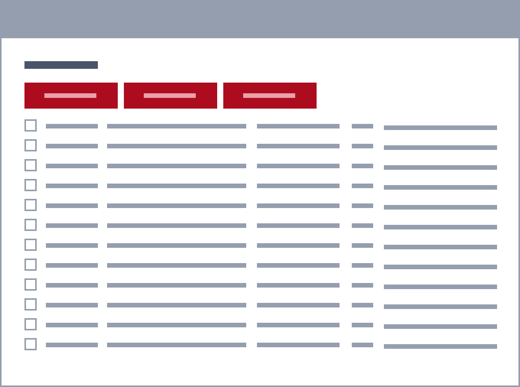
For the customer account management tool, perhaps we know our users are mostly account administrators who spend their entire day adding entries to the system. In this instance, we might conclude that it’s useful to include multiple calls to action of equal importance on a single screen, where our users can see and access them quickly.

(Note: the approach shown in the last example could be just as useful for a regularly-accessed consumer-facing service like an email inbox. If we’d tucked it away in a separate design system for internal services, we might have missed this opportunity.)
In both cases described above, the button in question can be designed and built identically, but the usage guidance needs to acknowledge and accommodate the different scenarios.
By considering the range of scenarios in which our components and patterns might be used, we can create flexible solutions that work across a broader set of contexts.
In conclusion
Our colleagues are users too, and it’s important that we uphold the same standards for internal services as we do for consumer-facing products.
Creating separate design systems or patterns to support this work only deepens the divide, making it harder to see the overlaps in our work.
Removing the arbitrary line between internal and external users helps us to maximise opportunities to reuse solutions and create scalable, flexible design patterns.
And finally, creating design systems that focus on user needs rather than user types means we can design usable, inclusive experiences, for all of our users.
Acknowledgements
Another enormous thank you to the ever-supportive Adam Silver for his invaluable feedback on this article, for designing the illustrations, and for always encouraging me to overcome my imposter syndrome and share my thoughts.
