Building conscious design systems
This post is based on my recent talk, Building conscious design systems, which I gave at WDC and GOV Design Systems Day.
Here's the WDC version if you prefer to watch it.
When we talk about the benefits of design systems, the 3 most common promises are:
- efficiency: a design system will reduce waste in your design and development processes, and help you go faster
- consistency: a design system will help you standardise your digital experiences
- scale: a design system will help you scale your design decisions across your product landscape
But here’s the thing we rarely ever say: None of this has any inherent value.
Efficiency is only valuable if it helps us move faster towards meaningful outcomes for the people using our products and services.
Consistency is only valuable if we standardise things to a good level of quality.
And scaling things is only valuable if they’re actually worth reproducing.
And although this might sound obvious, I say it because I’ve noticed a shift in the conversation around design systems lately that concerns me.
It feels to me as though we’ve become so fixated on the mechanisms that make it possible to deliver those promises—of efficiency, consistency and scale—that we’ve lost sight of the why.
How design systems create value
People often point out that design system teams are there to enable teams creating the product experience, but they themselves are not responsible for it.
And whilst I do agree that design system teams cannot be solely responsible for the resulting user experiences and outcomes, I also don’t believe they can draw such a hard boundary.
If we agree that there’s no inherent value in the added capability promised by design systems—efficiency, consistency, and the ability to scale—then the value must lie in what we do with it.
But this introduces a problem.
Because if we can use our design systems to speed up meaningful work, standardise things to a high quality, and scale the things we actually want to reproduce - then the reverse is also true.
It means that we can also use our design systems to:
- speed up problematic work
- standardise things to a poor quality
- scale things we don’t want to reproduce
In other words, not only is this work not inherently valuable, it is also not inherently harmless - and that’s something I don’t think we can ignore.
The risk of design systems
To explore the ways in which design systems present a risk - and what happens if that risk isn’t managed - we should start by thinking about how they work, at the most basic level.
We create design systems by curating and distributing a collection of components, patterns and content.
As teams in our organisation start using the system to build websites and applications, these things start to get scaled across our digital product landscape.
But it’s important to say again that the mechanisms our design systems use to scale have no inherent value unless they’re things we actually want to scale.
And what if they’re not?
To explore that, we can look at some examples of what happens when the risk of design systems isn’t managed.
Example 1: Dropdowns
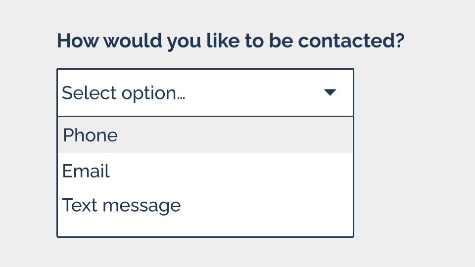
Let’s start by looking at a pretty common component. This is called a select - you might also know it as a select. It’s normally used to let people pick an option from a list.

But even though it’s pretty prevalent - the accessibility issues with it are well-documented.
Back in 2014, Alice Bartlett—a frontend developer who was working at the Government Digital Service at the time—gave a talk describing the problems she’d observed people having when trying to use a select.
Again and again, she saw users:
- being unable to close the select
- trying to type into the select
- confusing focused items with selected items
- trying to pinch zoom select options on tablets
And the thing is that a lot of the time, these issues are completely avoidable. In many cases, we don’t really need to use a dropdown, and could just as easily let our users answer using:
- radio buttons
- a free text input
- a text input with an autocomplete
This doesn’t mean we should never use them: There are times where a select component is genuinely the best or indeed the only option. But they probably shouldn’t be the first thing we turn to.
And this is where I think design system documentation needs to do some of the heavy lifting.
Because there’s a significant difference between a design system that says “here’s a dropdown - knock yourself out” and one that consciously:
- lays out the problems it carries
- describes the common alternatives
- helps designers and developers to make an informed decision about choosing to use one
A good design system helps its users make informed, conscious choices about when and when not to use components.
Example 2: Asking for people’s names
We can start with a common pattern - how we ask users for their name. This is something most design systems include.
But when I think about how lack of diversity in our industry as a whole really shows up in our work - this is one of the first things I think about.
And that’s because a lot of us working in this space have some very narrow and biased ideas about names - see this list of 40 false beliefs about names put together by Patrick McKenzie.
When these false assumptions inform our design systems, and our patterns for asking people for names, we start to exclude people.

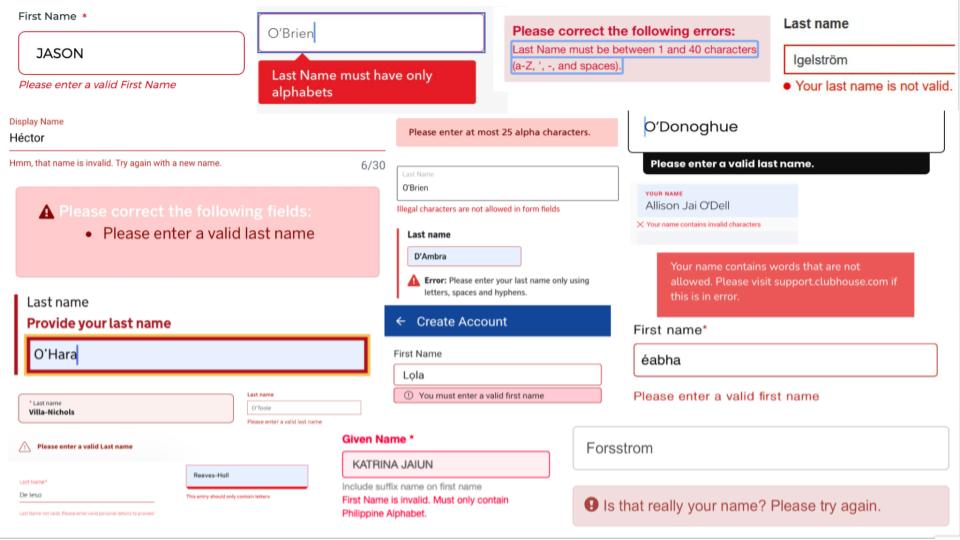
There are hundreds and hundreds and hundreds of people being told their names are invalid, all all over the internet. There’s even a whole Twitter account dedicated to validation error messages on name fields.
And when I was collecting these examples, I was struck by a recurring comment made by people on the receiving end of these errors:
“This is the story of my life”
When this happens to people again and again and again, we’re giving them a clear message: this is not for you. We become authors in that story of exclusion.
In reality, our design systems cover much more than just name fields.
Our design systems are not just harmless scaling machines
When we don’t design for this full human spectrum of identities and characteristics and circumstances and experiences that our design system needs to serve, we’re not just excluding people - we’re erasing them.
Because although our design systems might sometimes seem like harmless scaling machines, we’ve got to start thinking about the human impact.
What happens if our components are inaccessible? What if our patterns are discriminatory, or our content is exclusionary?
What happens is we create a system of harm.
We industrialise discrimination, and set up a production line which allows us to ship exclusion to the people using our products: quickly, consistently, and at scale.
Design systems don’t cause all harm and design systems can’t prevent all harm. But…
Design systems alone are not responsible for these problems.
Design systems form part of our wider digital, political and social systems, and it’s those systems in their entirety that foster these problems.
But design systems can certainly perpetuate these problems and, I believe, can help to counteract them.
What we absolutely can do is recognise and mitigate risks and work to build conscious design systems.
So how do we do that?
How to create conscious design systems
1. Don’t assume that common practice ≠ good practice
There’s a lot of debate about whether design systems should set out what good looks like, or simply systematise existing practices. But at the very least, we should distinguish between the two.
It’s important that those of us who are working on and contributing to design systems question what we consider to be default solutions, and recognise that common practice does not equal good practice.
Returning to the dropdown example that I shared earlier, we can clearly see how incredibly prevalent these have become in our digital services, despite known issues with them. And I can’t help but think that a big reason for this is just “everyone else is doing it”.
When we see a digital practice forming it’s easy to assume that we’ve converged on something sensible - but that’s not always the case. Don’t underestimate the power of the bandwagon effect.
And relatedly, I also want to point out that just because Google does it, that also doesn’t mean it’s good.
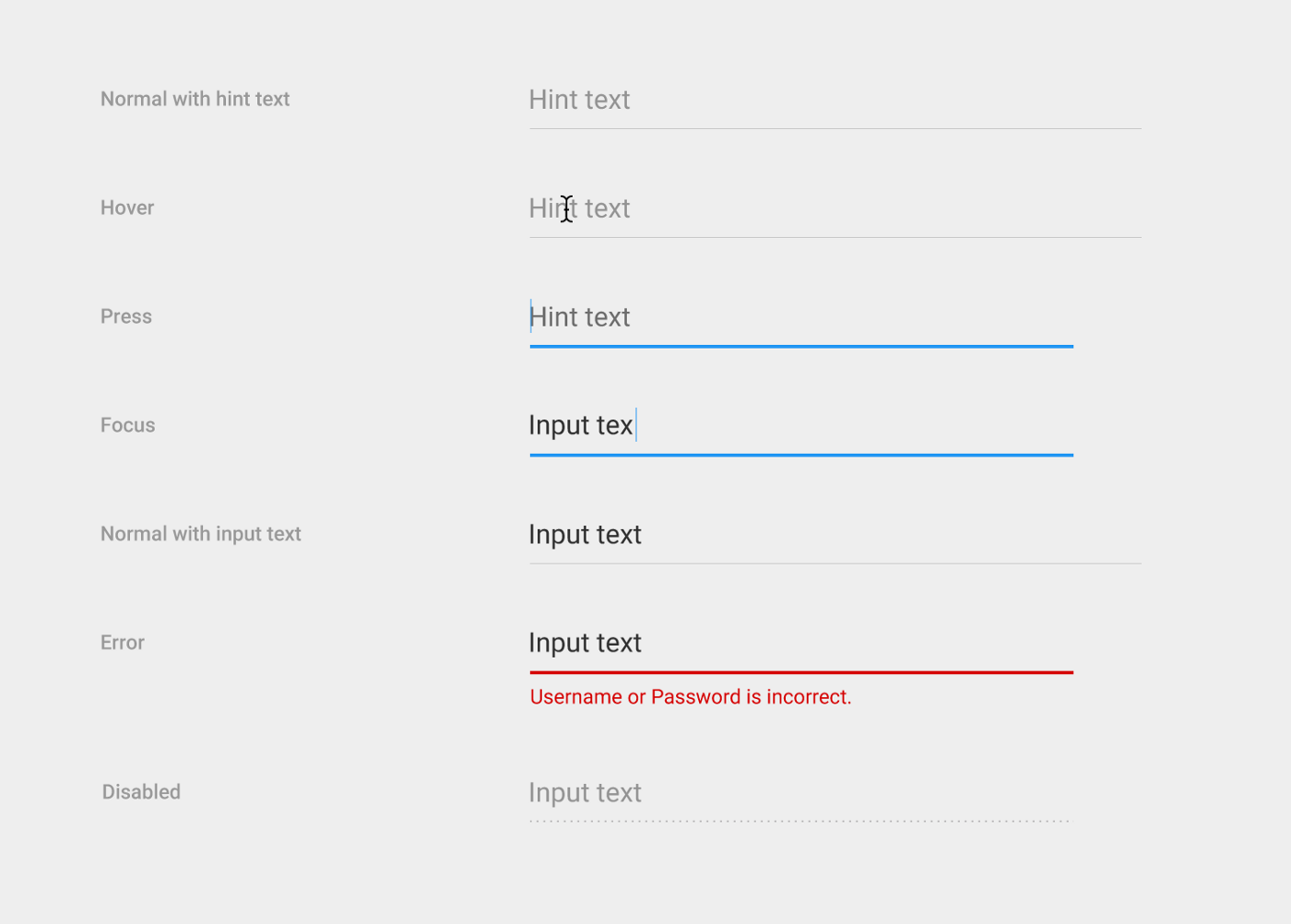
Case in point: Until 2017, these were the text fields for Material UI - Google’s open source design system. Google’s design replaced traditional input boxes, for users to type into, with lines, for users to type onto.

This unconventional approach raised concerns with some designers and developers, who suspected that the affordance of the line would cause confusion for some people, and impact usability. But this was Google - so a lot of those people who had concerns, found themselves shouting into the void.
In my colleague Heydon Pickering’s article, Listen to me and not Google he describes the frustration of trying to convince a client to avoid Google’s approach and use a more conventional input box instead.
But the client felt that the source of this approach legitimized it. (Don’t underestimate authority bias.)
Then, in 2017, Google announced it was redesigning its text fields.
After deciding to conduct some usability testing on the original design, Google discovered for itself the issues that others had raised.
They wrote “The line affordance under the old text fields was not clear to some users [and] was confused with a divider.”
The trouble was, that even though Material UI may have updated its text fields, thousands of other organisations had already adopted its first design and have not followed suit on the change.
I don’t want to go too hard on Google here, but I will say that with great power comes great responsibility. People assumed that Google would have done its research in the first place, and that its patterns could be relied upon.
That’s why it’s so important to question our defaults - prevalence is not an indicator of quality. Just because an approach is common, doesn’t mean it’s inclusive.
2. Prioritise inclusion at every level
A theme across the examples I’ve shared here is exclusion. When we create design systems without a conscious intention to mitigate harm, and a strategy to help us fulfil that intent, we end up excluding people.
So to counteract this, we can think about inclusion.
Inclusion doesn’t start and finish with the experience of the people using our products.
The question of inclusion begins at the level of the design system team, and then expands out through:
- people who contribute to the design system
- teams who use the design system to build their products and services
- the wider organisation
- and eventually the community of people who use the products it's used to create
It’s important for us to think about inclusion at all those levels, to understand whether the experiences we’re helping to create are inclusive or not.
So perhaps the very first place to start is with the team who creates and maintains a design system. And a quick test might be: does that team look like this?

Now it’s really important to say that diversity isn’t inclusivity. Diversity is just variety. And aiming to recruit a diverse team without thinking about inclusivity is a recipe for disaster.
But if you don’t have or can’t sustain a diverse team, it’s a good indicator that it’s not inclusive.
So why does this matter? How is it that those of us creating design systems can impact the people who are all those layers away, using the products and services they’re used to build?
It all comes down to the knowledge and experiences that get fed into our design systems.
Kim Crayton, Antiracist Economist, talks about 2 types of knowledge:
- Explicit knowledge, which is easy to articulate, codify and store, and can easily be transferred to another person
- Tacit knowledge, which is difficult to transfer to another person by writing it down and verbalising it
Tacit knowledge is acquired through lived experiences - and it’s this that enables us to propagate inclusivity through our systems.
Or to put it another way: If we’re not building our design system in an inclusive environment that supports participation from a diverse set of perspectives - it’s near impossible for us to design inclusive experiences.
And if we haven’t experienced exclusion, it’s very hard to mitigate it because we’re much less likely to spot it until it’s too late.
I am not a diversity, equity and inclusion specialist - but I can see the connection between a lack of attention to inclusivity in organisations and the lack of inclusivity of experiences they create - and having visibility of this is the first step towards addressing it.
3. Create strong feedback loops
To create conscious design systems, we’ve got to understand their impact and be able to respond accordingly - and that means having strong feedback loops.
One important way we can do this is to invite contribution from the teams who are using our design systems to create products and services.
I’m not going to cover contribution in detail here as I’ve written several, more detail articles on the subject before:
- Your design system contribution practice is doomed
- Opening up the GOV.UK Design System for contribution
- 5 lessons in enabling contribution
- Enabling contribution in the early days of the Babylon Health design system
- Crediting contributors in design systems
The bottom line, when it comes to contribution, is that it’s very hard to create sustainable contribution practices - and we absolutely must do it anyway.
4. Centre stress cases
It wouldn’t be practical to try and create our design systems in such a way that they’re 100% inclusive for every single person, and every scenario in which they might access something from it.
Human beings are complex, and there are too many variables to consider, so we have to think about a more practical option.
My advice is to prioritise the people who are most at risk of harm if we don’t take them into consideration. Or to put it another way: prioritise stress cases.
The term “stress cases” was coined by Eric Meyer and Sara Wachter Boettcher in their book Design for Real Life, which I really recommend if you haven’t read it.
The book says: “Real life is complicated… We might experience harassment or abuse, lose a loved one, become chronically ill, get into an accident, have a financial emergency, or simply be vulnerable for not fitting into society’s expectations.”
Historically, our industry has called these edge cases because they only affect a small number of users.
In the book, Sara and Eric propose redefining these situations not as edge cases, but as stress cases: “the moments that put our design and content choices to the test of real life”.
Instead of treating stressful situations as fringe concerns, we should move them to the centre and start with the most vulnerable users, and then work our way outward.
And if you’re thinking this all sounds like an awful lot of work, you’re right.
Building a conscious design system will slow you down—do it anyway
Building a conscious design system will slow you down. There are no silver bullets here because part of building a conscious approach is reducing our speed to understand our impact.
Nothing I’ve shared here is a quick fix, but it’s a direction of travel.
It’s important that we balance the conversation around design systems and spend at least as much time talking about human impact as we do about the mechanics of our design systems.
The mechanisms our design systems use will change because technology will change, our environment will change, our requirements will change and our expectations will change. Concentrating on human impact provides a consistent focus, and will help us to weather this change and adapt our systems accordingly.
And in the end, it’s the only thing that really matters. We can’t know exactly what challenges lie ahead in the world of design systems, and certainly in the wider world - but we can choose what to centre.
We can choose to create conscious design systems that put people at their heart, even if it slows us down.
We can choose to do it anyway.
